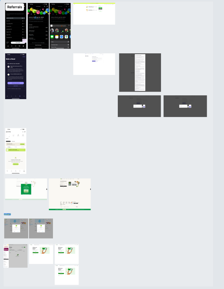
Referrals
Aceable serves hundreds of thousands of learners across licensing and education programs, where growth is driven largely by trust and word of mouth. While referrals existed prior to this project, they were underutilized. Learners were unclear on when to refer, how referrals worked, and what value they or their friends would receive, resulting in low engagement, missed organic growth, and increased support volume.
This project reimagined referrals as a first-class, learner-centered growth experience. The goal was to make referrals feel intuitive, timely, and trustworthy rather than transactional. The work focused on clearer entry points, simplified flows, and incentive framing aligned with moments of learner success. Spanning web, iOS, and Android, this effort validated referrals as a scalable acquisition and retention lever while preserving Aceable’s learner-first experience.
Role
Lead Product Designer
Platforms
Web, iOS, Android
Deliverables
Launched referrals as a core growth capability across web, iOS, and Android
Designed the end-to-end referral experience, from entry points through sharing, reward tracking, and confirmation
Conducted user research and usability testing to validate messaging, incentives, and flow clarity
Created high-fidelity, cross-platform UI designs and interactive prototypes in Figma
Defined referral states, microcopy, and reusable components contributed to the design system
Partnered with Product, Engineering, Growth, and Data to ensure accurate tracking and scalable implementation
Supported post-launch iteration using analytics, conversion metrics, and qualitative feedback
Project Overview
Context:
What Aceable is
Ed-tech company offering licensing and certification courses (driver’s ed, insurance, real estate).
Growth depends heavily on trust and word-of-mouth.
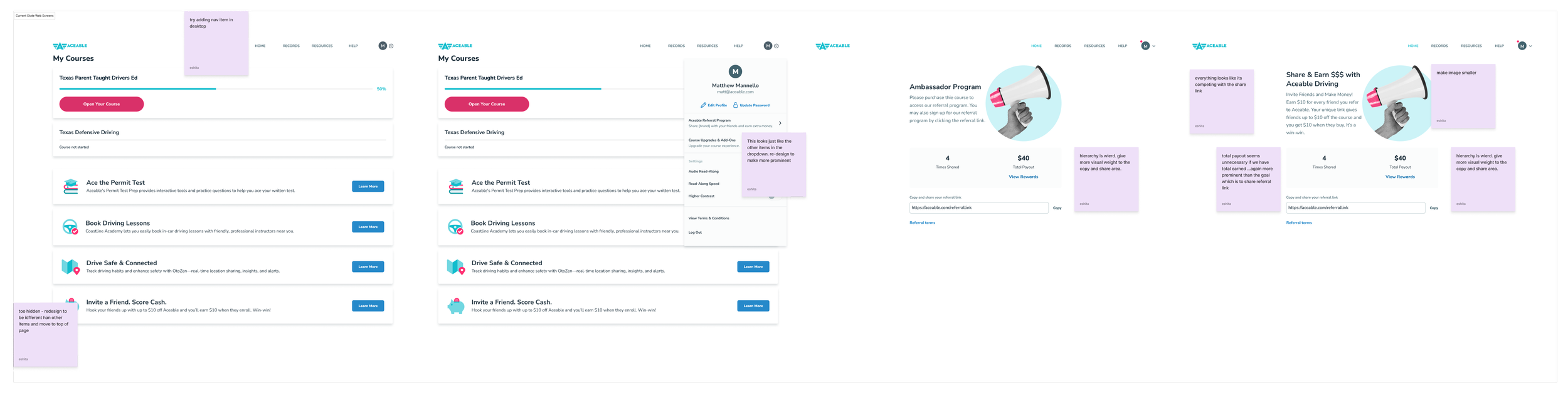
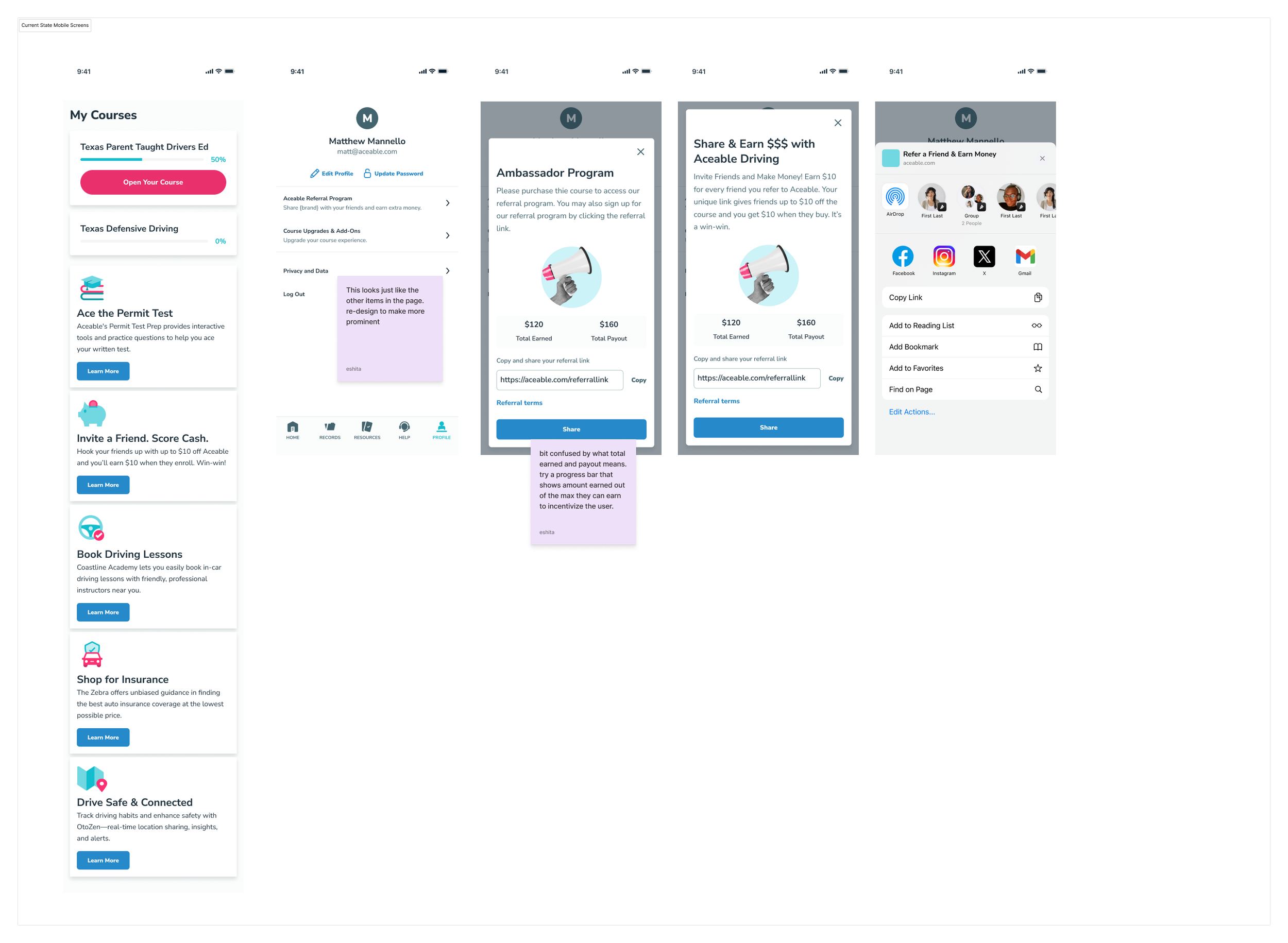
The problem
Referrals existed, but engagement and conversion were low.
Users didn’t clearly understand:
Why to refer
When to refer
What they or their friend would get
The experience felt buried and transactional rather than social.
Goals:
User goals
Make it easy and intuitive for learners to invite friends without disrupting their primary learning experience
Clearly communicate how referrals work, what actions are required, and when rewards are earned
Build trust and motivation by setting accurate expectations around referral eligibility and rewards
Reduce cognitive load by surfacing referral status, progress, and rewards in a transparent way
Business goals
Introduce referrals as a measurable, low-friction growth channel
Increase organic sign-ups relative to paid acquisition
Validate referrals as a repeatable retention lever across platforms
Ensure accurate attribution and reward fulfillment to enable future experimentation
My Role:
As the sole Product Designer, I led the end-to-end UX design for the Referrals experience across web, iOS, and Android. My responsibilities spanned problem framing, user research, journey mapping, interaction design, and high-fidelity UI design. I partnered closely with Product, Engineering, Growth, and Data teams to define requirements, validate concepts through research and testing, and ensure accurate tracking and scalable implementation. I also contributed reusable patterns to the design system and supported post-launch iteration based on analytics and user feedback.
Results
Outcome:
Shipped across mobile (iOS and Android) and web
Increased referral engagement by 38% within the first 8 weeks post-launch
Referral CTA click-through rate improved by 27%, indicating stronger value comprehension
Referral-related support tickets decreased by 22% after rollout
Design Process
Research & Discovery:
What signals triggered deeper research
Drop-off in referral funnel
Low visibility of referral entry points
CX tickets asking basic questions about referrals
I intentionally combined lightweight qualitative research with quantitative signals to move quickly while reducing risk, starting broad to understand why referrals underperformed and narrowing into evaluative testing as concepts solidified.
Research methods
Discovery / Generative Research
Goal: understand the problem space and user motivations
Quantitative
Funnel analysis: Identified where users dropped off in the referral flow to pinpoint high-friction steps.
Support ticket review: Analyzed referral-related tickets to surface recurring confusion and unmet expectations.
Qualitative
Lightweight user interviews: Spoke with recent learners to understand mental models, motivations, and hesitations around referrals.
Competitive analysis: Studied referral patterns from Duolingo, Uber, and Dropbox to identify proven incentive framing and UX patterns.
Evaluative Research
Goal: validate solutions and reduce risk before and after launch
Quantitative
Usability testing (existing flow): Evaluated clarity, comprehension, and friction in the current referral experience.
V0 prototype validation: Tested early prototypes to iterate quickly on messaging, flow structure, and incentive clarity.
Qualitative
In-product experimentation (Appcues): Tested referral entry points and educational messaging with real users in production.
A/B testing: Measured the impact of CTA copy, incentive framing, and flow sequencing on referral engagement and conversion.
Why This Approach Worked
We started broad to understand why referrals weren’t working, then progressively narrowed into testing and validating solutions, balancing qualitative insight with quantitative confidence at each stage of the design process.
Key insights:
Timing matters more than placement
Users were most receptive after completing a milestone (passing a test, finishing a lesson).
Clear value framing drives referral action
Users were more motivated when the referral benefit was clearly stated upfront.
Cognitive load killed intent
Too much explanation upfront reduced follow-through.
Unclear success state
Users didn’t know if their referral “worked.”
Design principles derived from research
Trigger referrals at moments of user pride
Lead with clear incentive value
Reduce steps to one primary action
Always show progress and confirmation
“I shared the link, but I had no idea if it worked or what was supposed to happen next.”
Design Approach:
I focused on three core principles:
Incentive clarity first
Users needed to immediately understand what they would receive and why it was worth sharing. Incentive value was surfaced early and reinforced throughout the flow.
Low-friction sharing
Referral actions were designed to feel fast, optional, and lightweight, minimizing cognitive load and reducing hesitation at the moment of sharing.
Trust and legitimacy
Clear framing, transparent terms, and consistent UI patterns helped referrals feel credible and intentional rather than spammy or promotional.
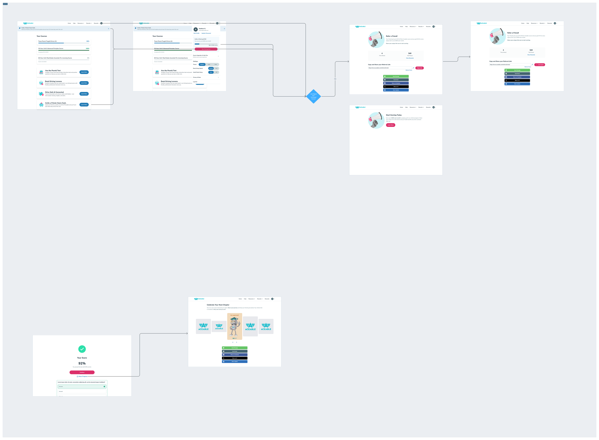
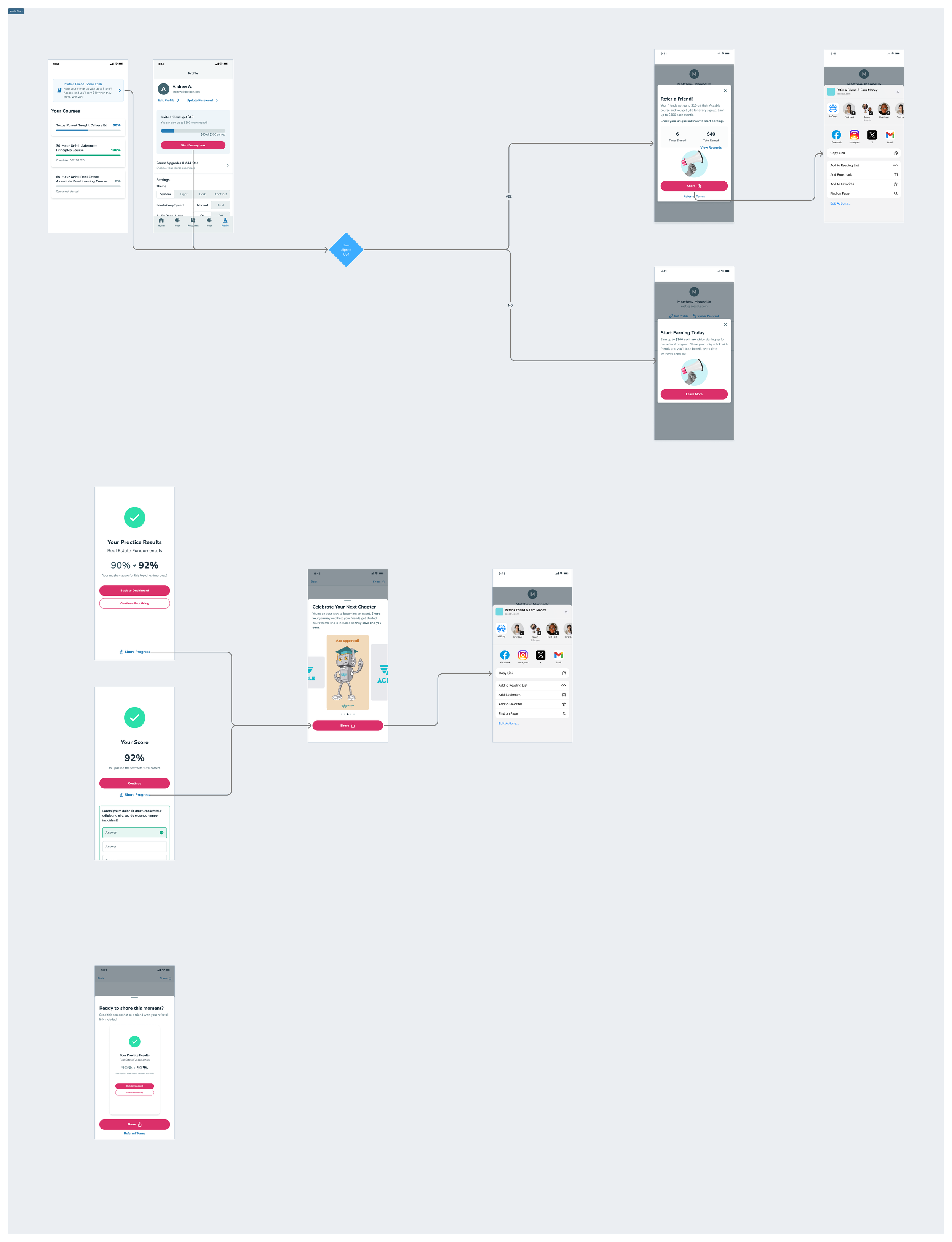
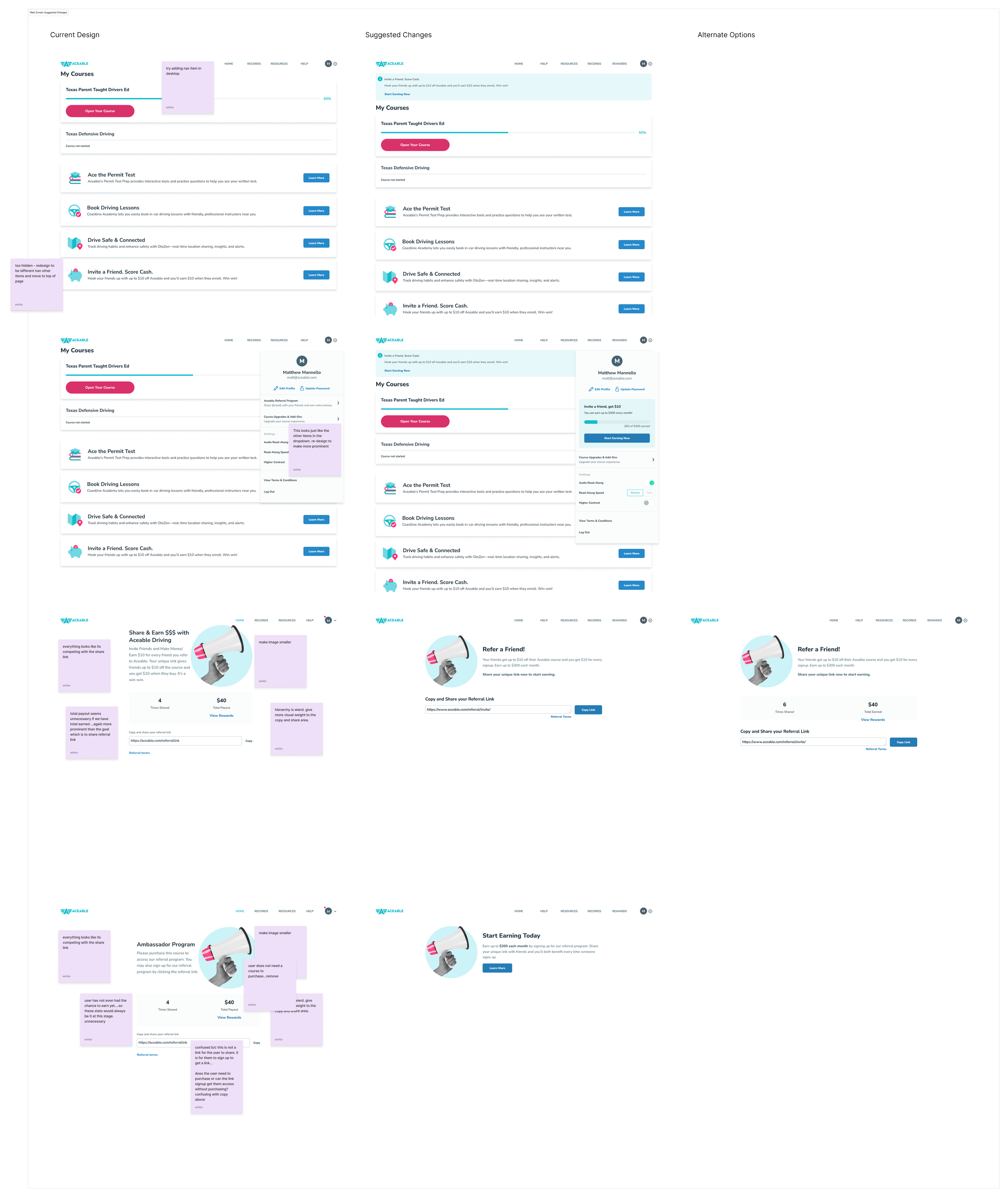
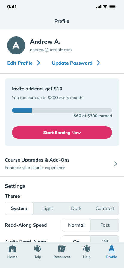
Solution
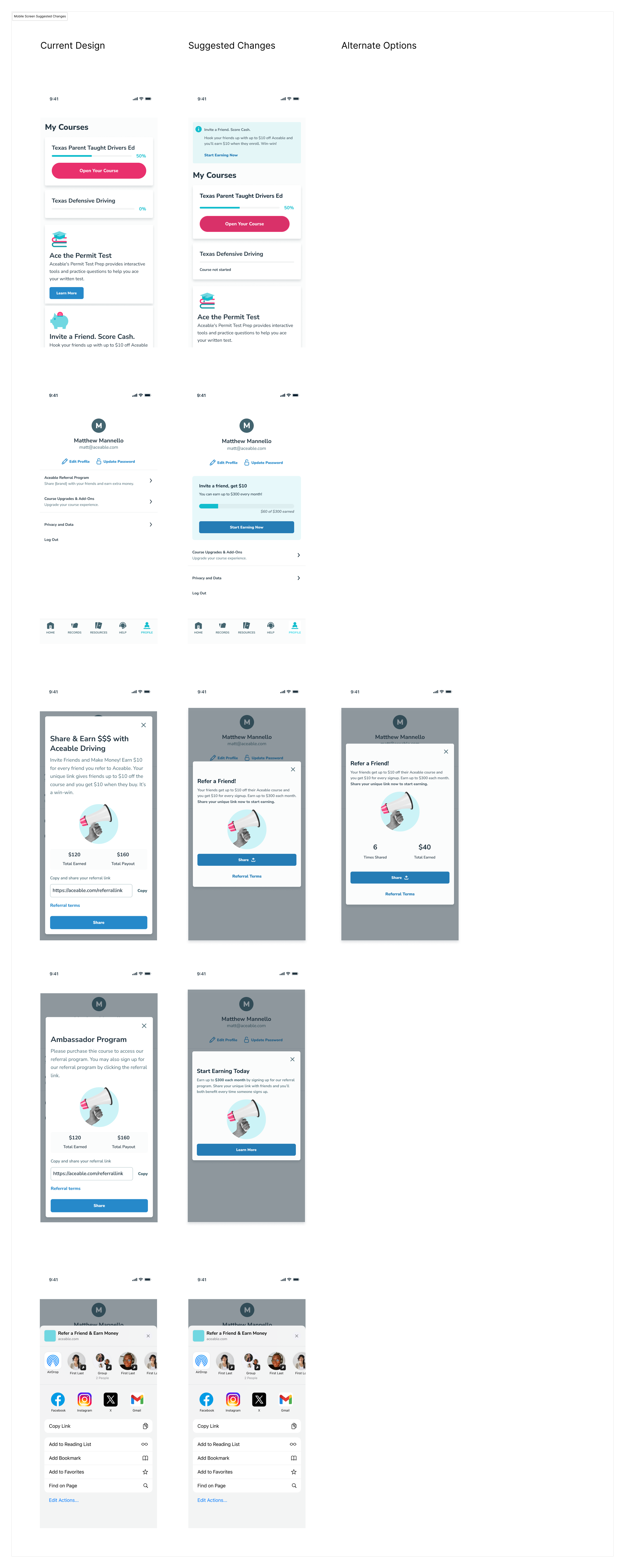
I intentionally avoided multi-step referral funnels or aggressive prompts. Instead, I focused on a single, primary action supported by clear value framing and immediate feedback. This balanced growth goals with user trust and aligned with Aceable’s learner-first brand.
The final solution introduced:
New referral entry points tied to milestones
Simplified referral flow (fewer steps, clearer CTA)
Share via screenshot support to enable quick, organic sharing across messaging apps and social platforms
Clear success and status states
Mobile-first UI with web parity
Intentional, value forward copy
Single, primary CTA to reduce friction
Balancing growth with user trust
Accessibility-first interaction patterns
I used high-fidelity Figma prototypes and v0 AI prototyping to rapidly explore layouts, flows, and interaction patterns and align early with engineering.
Validation & Iteration
Built a v0 prototype to quickly test:
Messaging
Flow clarity
Sharing behavior
Ran usability tests before finalizing UI
Iterated based on confusion points and drop-off moments
Results
Outcome:
Shipped across mobile (iOS and Android) and web
Increased referral engagement by 38% within the first 8 weeks post-launch
Referral CTA click-through rate improved by 27%, indicating stronger value comprehension
Referral-related support tickets decreased by 22% after rollout
Learnings & Next Steps
What I learned
Research doesn’t have to be heavy to be effective
Small copy and timing changes can outperform visual polish
Growth features perform best when they feel genuinely user-first rather than optimized purely for conversion
Next steps
Expand personalization: Tailor referral messaging and incentives based on learner behavior, course type, and progress stage to increase conversion.
Optimize incentive strategy: Continue testing reward visibility, timing, and framing to identify the highest-impact combinations for both referrers and recipients.
Deepen social sharing hooks: Explore richer share previews, reminders, and post-share nudges to increase successful referrals beyond the initial send.
Long-term measurement: Track downstream impact of referrals on retention, completion rates, and LTV to better understand the full business value of the program.